Cover reveal for the first book in the series
Posted on March 27th 2025
Note:
If the series gets traditionally published, this cover design and article will likely be shelved. I would defer to the publisher and marketing/design team as they will no doubt have much more experience than me.
But... if I do opt for self-publishing, this should prove an interesting look into my own book cover design process. I'll explain my thoughts and decisions below.
We all know not to judge a book by its cover, but it’s also true that first impressions really matter.
I think it’s safe to say most of us have judged a book by its cover, at least once or twice. It’s often the very first thing we notice after all. Cover design is that important.
It’s why there are so many talented professionals who focus solely on book cover design. Experts of their craft with many years of experience, available to hire at many different price points. Every bit of advice you’ll find recommends you hire one of them to design your book cover rather than attempt it yourself…
But considering my background in graphic design, there was no way I was passing up the opportunity to design my own book cover.
How bad could it be? Let’s find out.
I started off by collecting visual inspiration. This included some of my favourite book covers. Ones that evoke a certain ‘feeling’ I want readers to associate with my own book. But it also included plenty of other examples of design and artwork I liked. I often find the more varied your initial collection of inspiration, the better.
The idea is to have a big enough collection that patterns and motifs start to emerge (you can see that ornate archways were a common element in my inspiration).
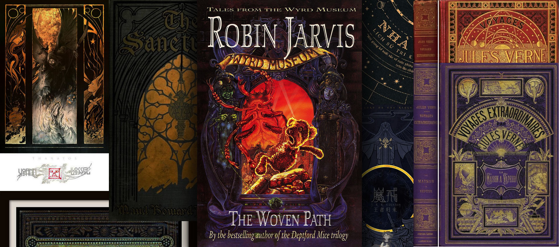
Side note, but one of my favourite authors, Robin Jarvis (who wrote the Wyrd Museum trilogy), also designed and illustrated his own covers (which are absolutely stunning). These original editions have pride of place on my bookshelves to this day.
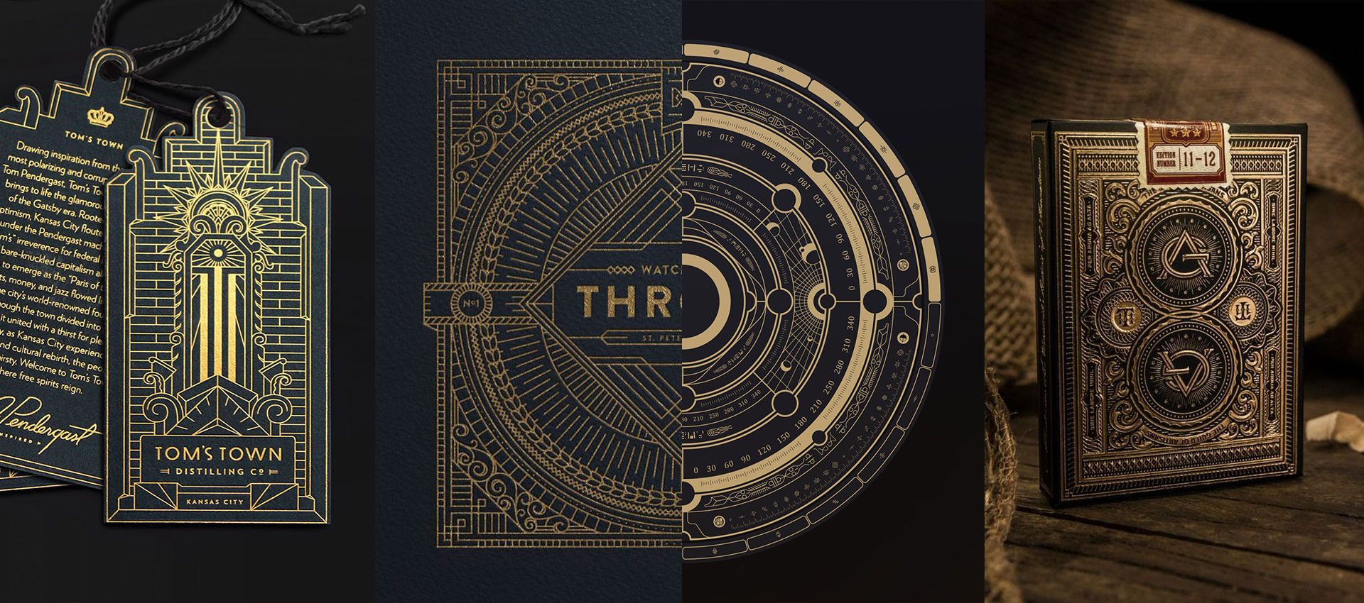
Another recurring element in my collection of inspiration was intricate golden line art, both decorative and illustrative. It always appeared to me as sophisticated and authorititive. Traditional and perhaps even a little historical. All things someone might think of when walking into the London Repository for the first time.
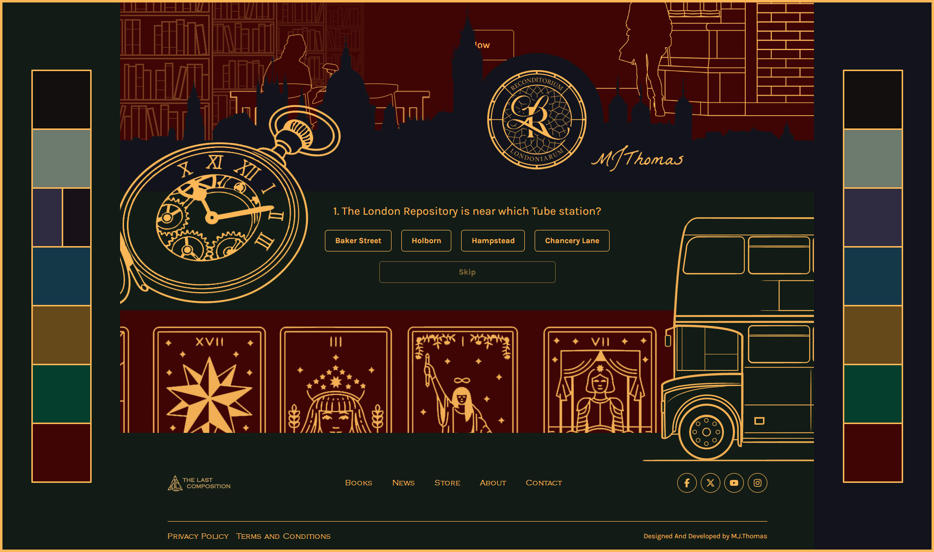
Then there was colour, where I knew I’d have to plan ahead for the rest of the series.
Each book would need a unique identity while still ensuring everything looked cohesive and intentional. For this reason I temporarily switched to working on the website instead, testing things like legibility and colour combinations in a different environment.
You can see below that I also started playing around with different styles of illustration, trying to imitate the intricate golden line art from my earlier research. At this point I realised the line art would be ideal for tying all of the books together, along with the dark green and dark blue you can see on either side.
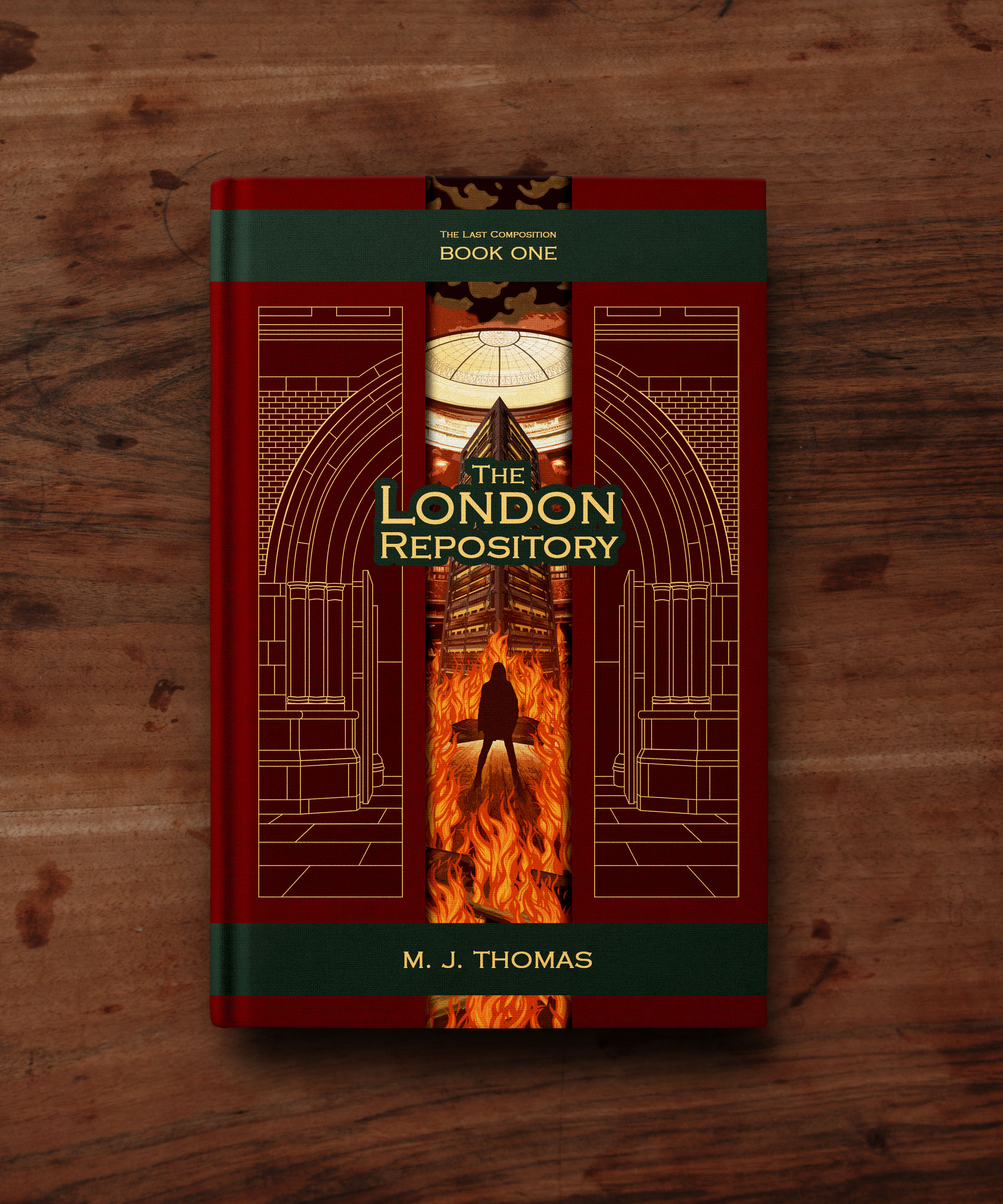
When considering a layout for the book cover, I wondered if I could hide any clues about important themes running through the series. I decided three individual columns would be a nice subtle nod to the three ‘sisters’ (and I won’t speak any further on the subject).
The idea of using golden line art for the left and right columns with a full colour illustration inbetween them seemed like a nice balance. That way, the reader could only see a ‘glimpse’ of what awaited them within, preserving the intrigue of the Repository.
You can see the exact moment I discovered the ‘arch’ could continue through the central column (an idea I’m looking forward to playing with more for the rest of the series).
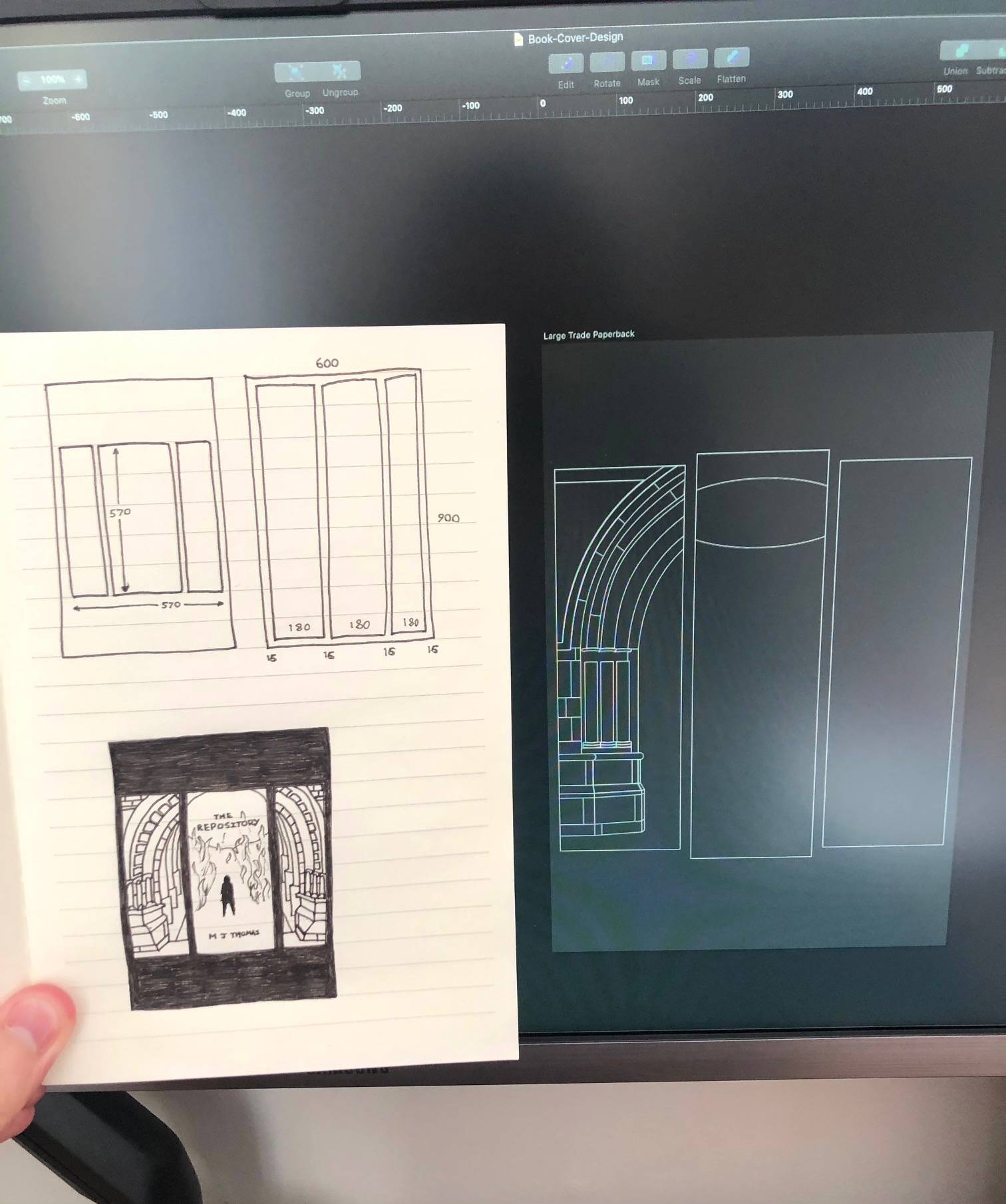
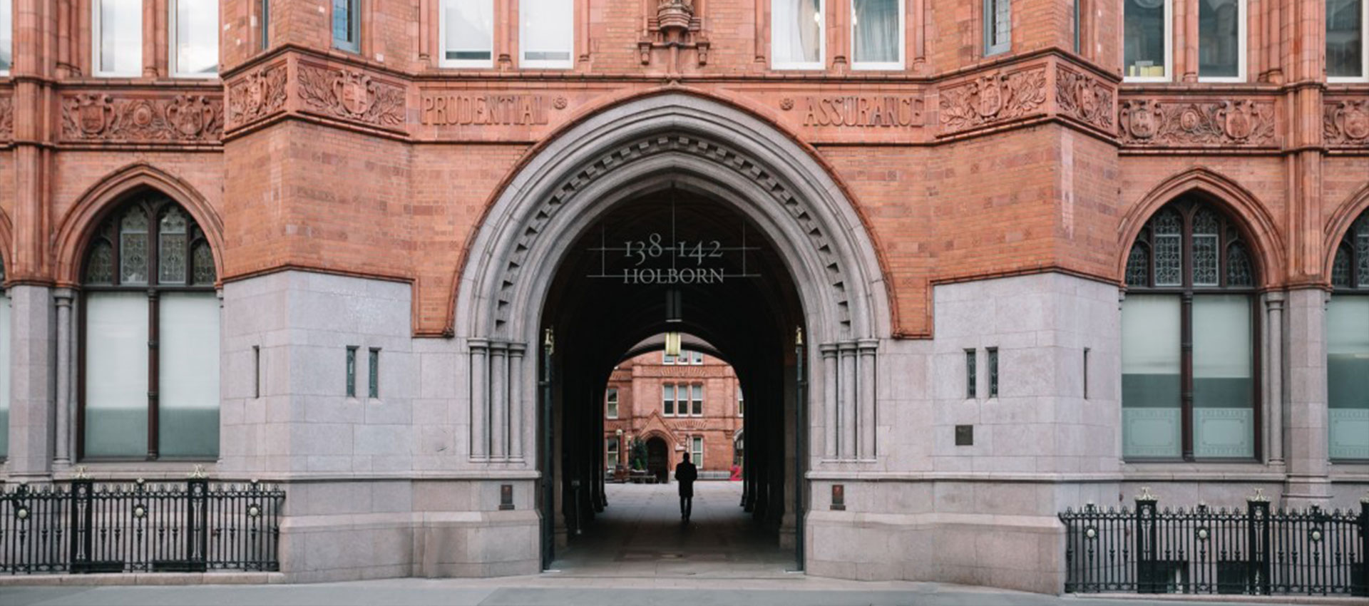
If you’re curious, the archway I recreated for the cover is based on the real entrance to Waterhouse Square, in Central London. You can read why in THIS ARTICLE.
Deciding on the central image was a daunting task, but picking a single moment from an entire book full of scenes was always going to be tricky. It had to be visually striking, but not give too much away. Bold and eye-catching, but genre-appropriate.
It should come as no surprise but I chose the climax of the book. A lone figure, surrounded on all sides by flames, facing an odd contraption beneath a large glass dome. Was this the London Repository? Why was it on fire? Who is the figure?
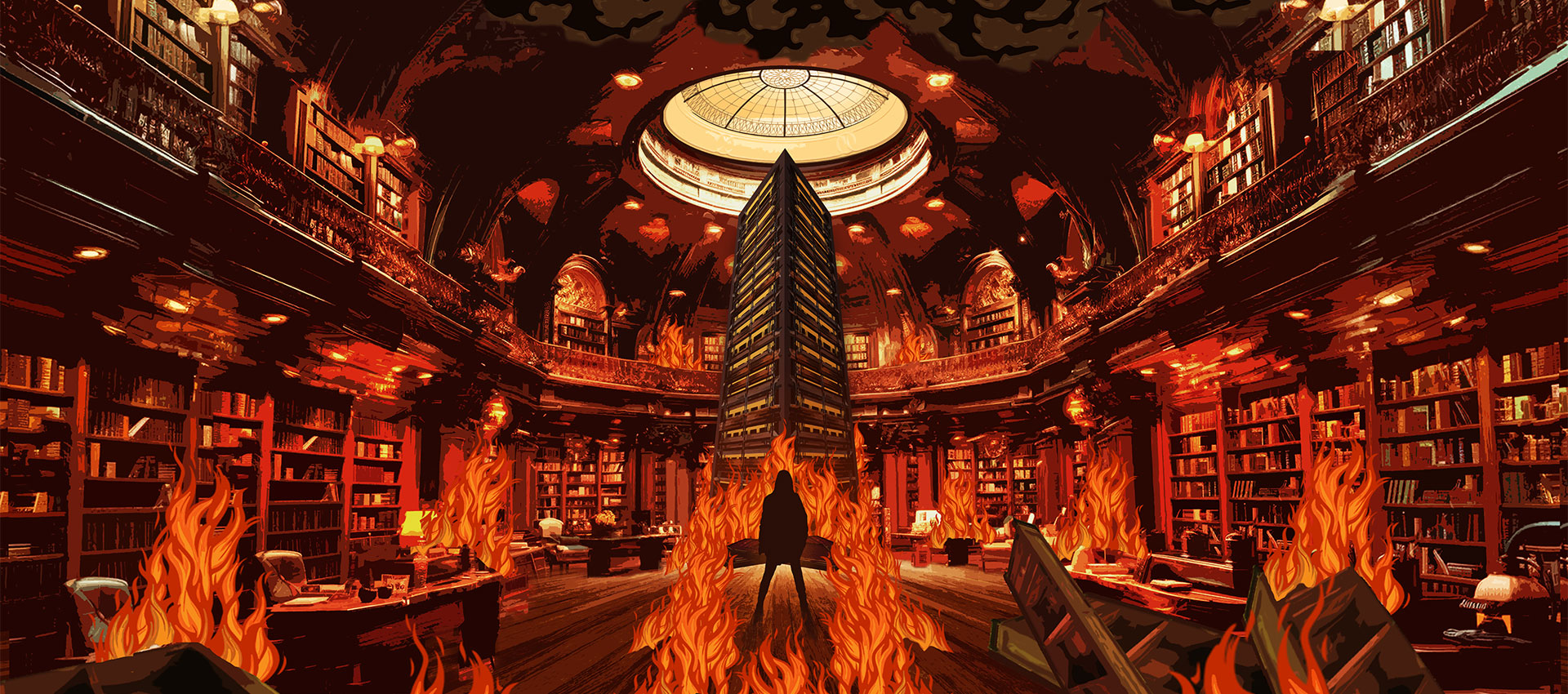
The glass dome completing the archway on either side was just the icing on the cake.
From there, all that was left to do was include the title of the book, my own name (which felt very weird), and some indication that this book was the first in a series.
I’ve personally never been a fan of pull-quotes or accolades on book covers so I declined to leave much space for them (though I’m sure I’d find space if any of my favourite authors ever said anything nice about the book).
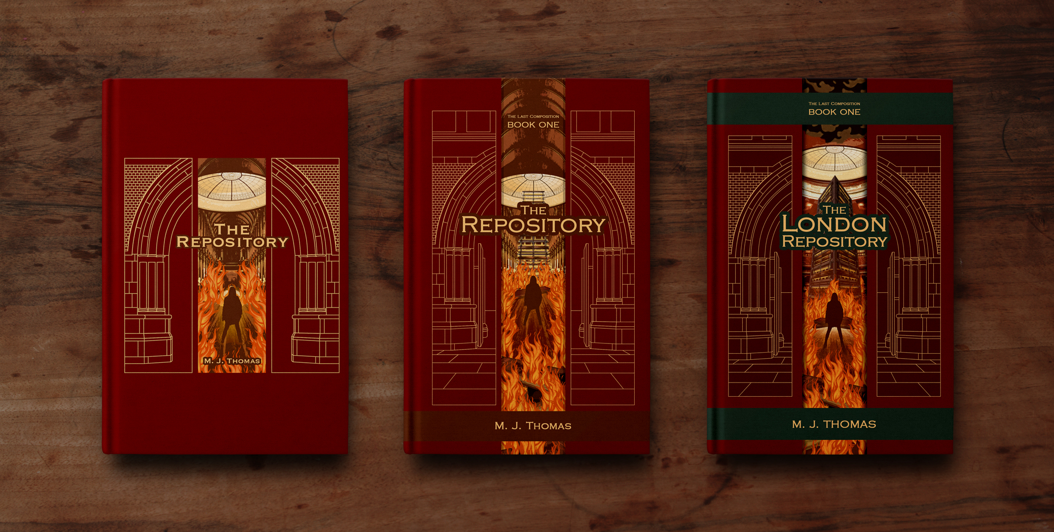
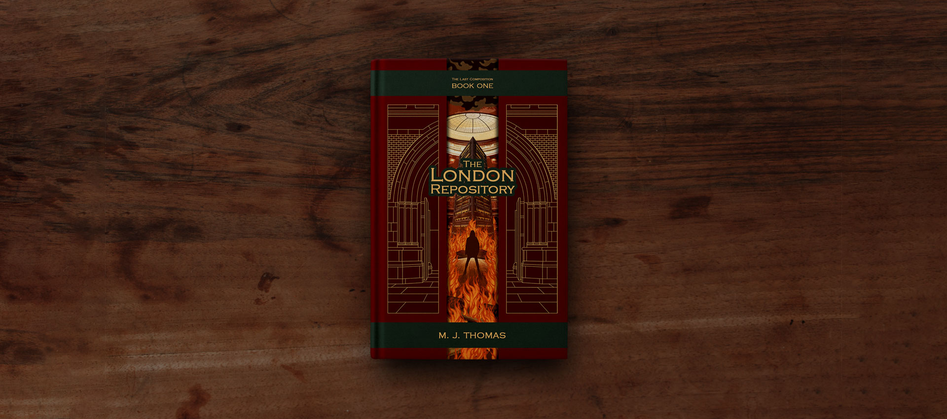
The dark green ribbons across the top and bottom of the cover will ‘wrap around’ the spine and onto the back cover, hopefully resembling clasps on an important old book.
They also provide a convenient place for the series information and author name.
If I’ve been clever, this layout and my colour choices should allow for the rest of the series to seamlessly follow on from here. All that remains to be said is…
Welcome to the London Repository!
I hope you enjoy your visit.